
Making Data Make Sense
Queue-it
Queue-it's GO platform had a lot of rich traffic data — but most stakeholders couldn't make sense of it. I redesigned the experience to give anyone a quick, shareable overview without needing to log in.

Rewriting Complexity
Queue-it
Inconsistent, overly complex texts were getting in the way of customers just trying to get things done. I rewrote the entire platform copy and built out a UX writing guide, a terminology framework, and a glossary to keep things consistent going forward.
Connecting Artists and Hosts
Low-Fi Concerts
Low-Fi was a platform and marketplace that connected artists with concert hosts and guests interested in home concerts.
As Head of Product, I reworked the platform’s usability and self-service features, increasing concerts from a few per month to one per day.
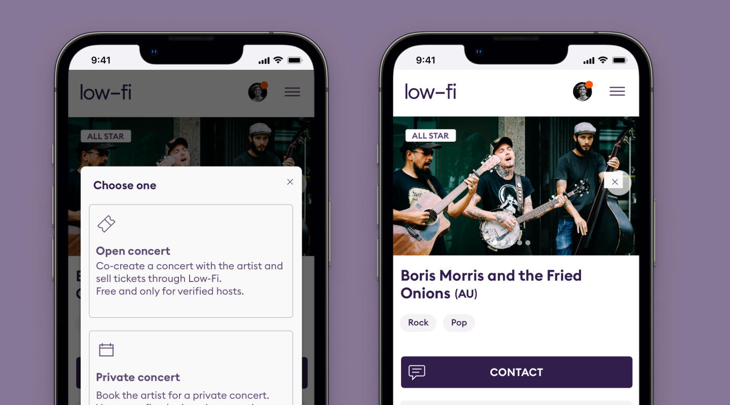
Case: Booking vs Hosting
Low-Fi Concerts
Opposite regular live music booking platforms, Low-Fi concerts are created between a host and a artist, and they sell tickets to guests through the platform.
That difference wasn't very transparent for the hosts, that often would book the artist for a fixed fee.
Designing for Accessibility
Nota
Nota had a long history of being the place where visually impaired people could read books in Braille and audio.
But as the technology has evolved, they needed a platform where the user could be self-sufficient when finding the right book.
Previous Work
2004-2017
Before I started working as a Product Designer, I worked for many years as a Graphic Designer, Illustrator, Copywriter, and Motion Graphics Designer.

About Me
My name is Anders Seierøe Mortensen. I have worked as a product designer since 2010.I've worked across wildly different domains — a library for the visually impaired, a marketplace for home concerts, and a traffic management platform.I love to work at the intersection of technology, behavioral psychology, and design, and enjoy working with other specialists to solve complex challenges.On the side I mentor new talent within the fields of product design and design thinking, sometimes through ADPList.
Send me a message
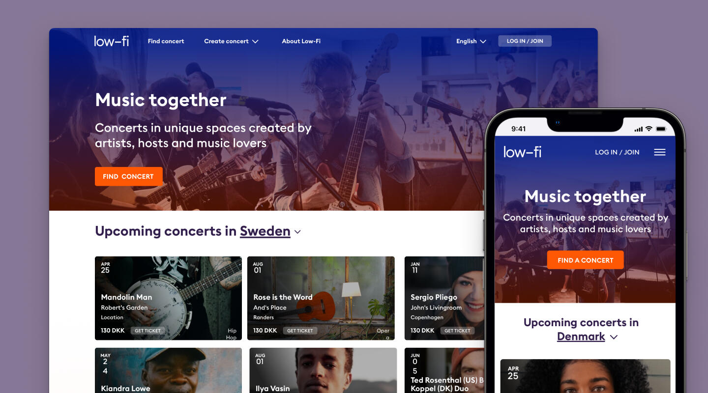
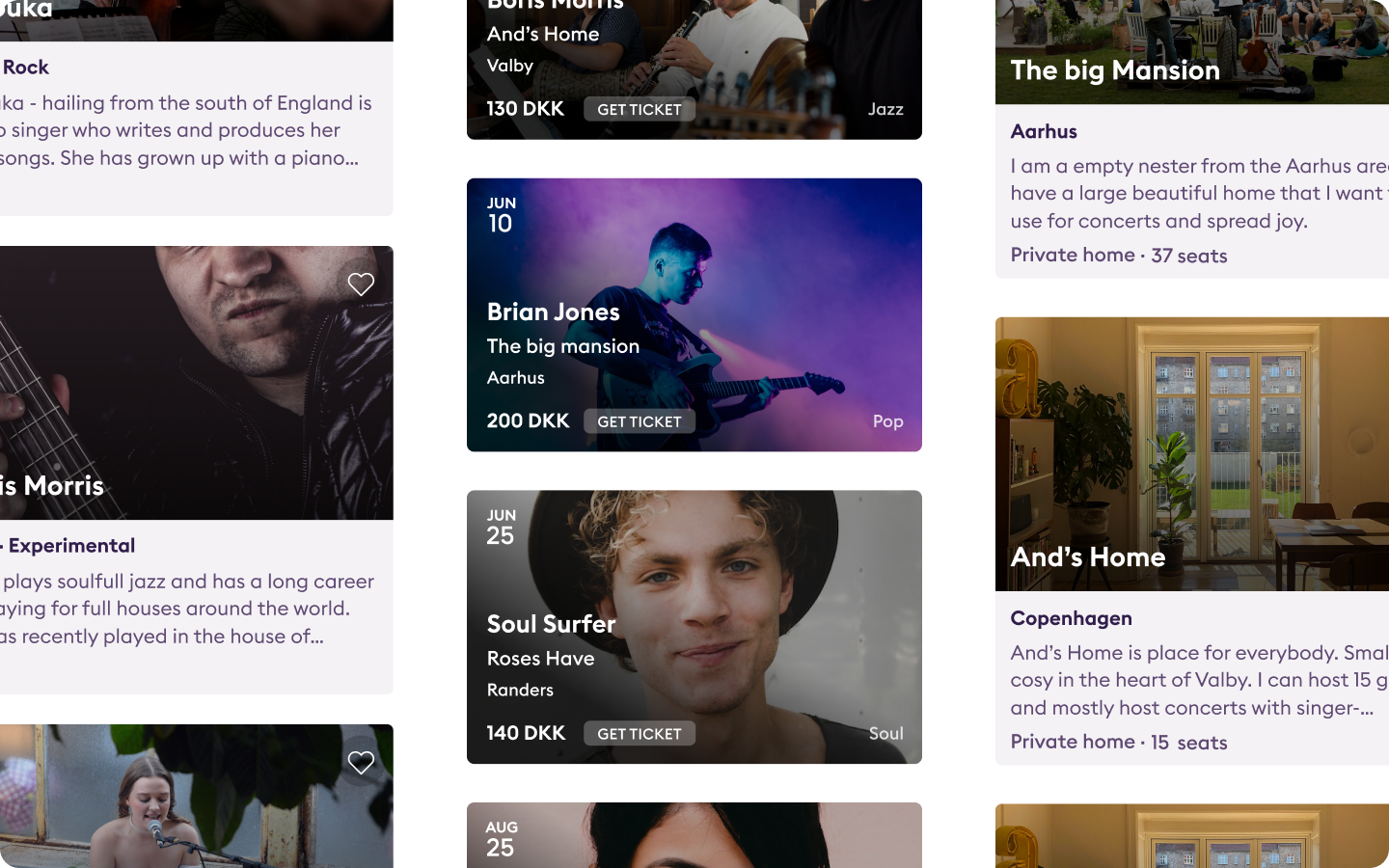
Low-Fi Concerts, 2019
Connecting artists and hosts
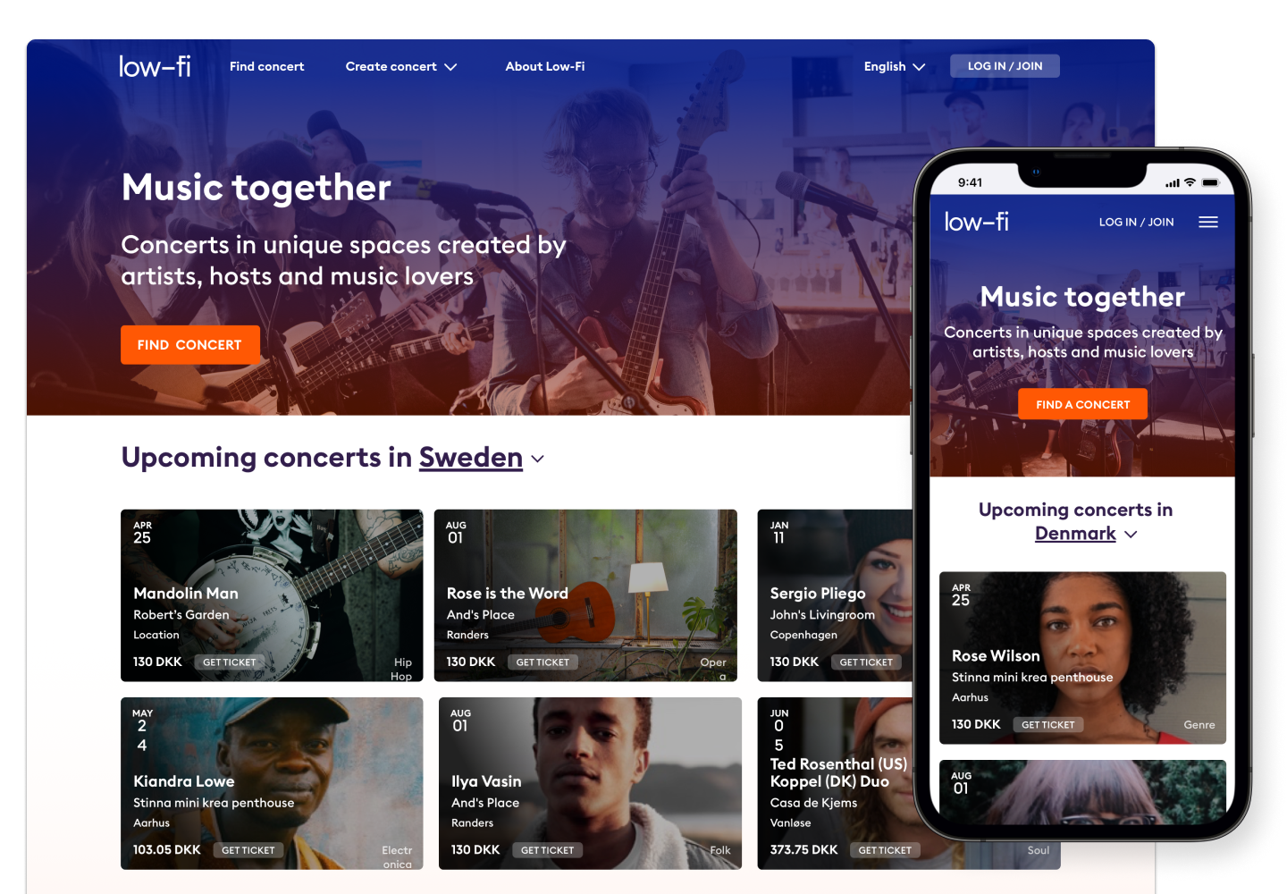
Low-Fi is a platform and marketplace that connects artists with concert hosts and guests interested in home concerts.
As Head of Product, I worked closely with the CEO and the Low-Fi team to develop and design the platform. Through extensive user research and testing, I improved usability and self-service capabilities, significantly increasing the number of concerts from a few per month to one per day. Additionally, I helped expand the platform’s reach to multiple markets by implementing localized and location-specific changes.Beyond the user platform, I also developed an internal admin platform for Low-Fi to manage hosts, artists, and concerts efficiently.

Main Page

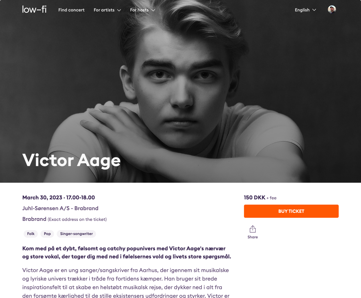
Concert page

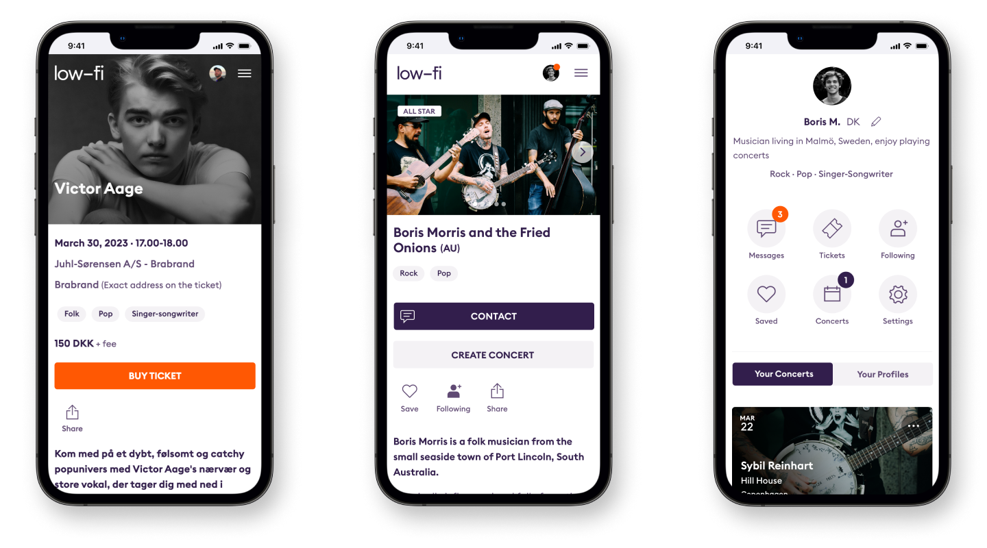
Phone screens

Creators cards
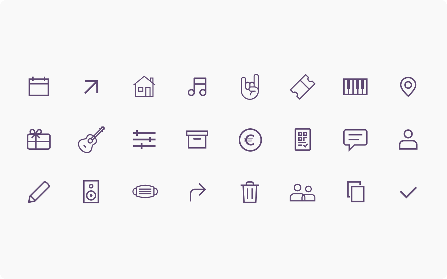
Custom icons
Nota, 2016
Designing for Accessibility
Nota Library had a long history of being the place where visually impaired people could read books in Braille and audio.
But as the technology and the user group had evolved, they needed a website where the user could be self-sufficient when finding the right book instead of manually calling the library or getting help from an assistant.
Here are some of the most important parts the challenges I had to solve:
- Easy navigation with a clear hierarchy to accommodate people, who use a screen reader.
- High contrast for people with low vision.
- Clear icons and colors to help people with dyslexia.
- Easy to find the right book in the right format.
- Incorporating a streaming service for audiobooks with and without text.
Throughout the design process, we tested the design with all user groups, first people with dyslexia and people with low vision. And later with people who were dependent on screen readers.

A simple navigation with clear structure and contrast was important for the user group. The use of icons everywhere was especially important for the young dyslexic user.

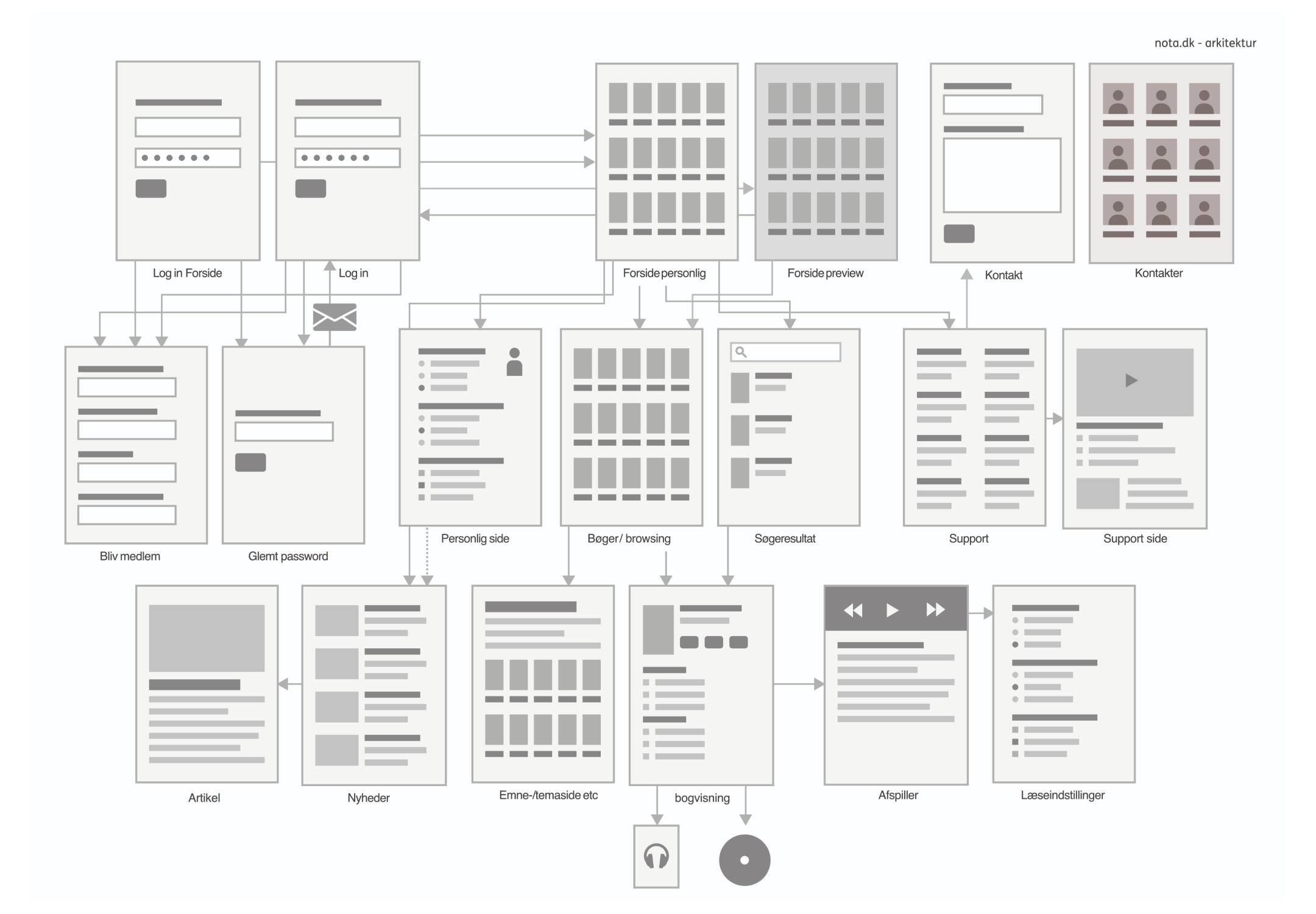
Early on I drew out the architecture of the whole site, to make sure I got the navigation right and kept it simple.

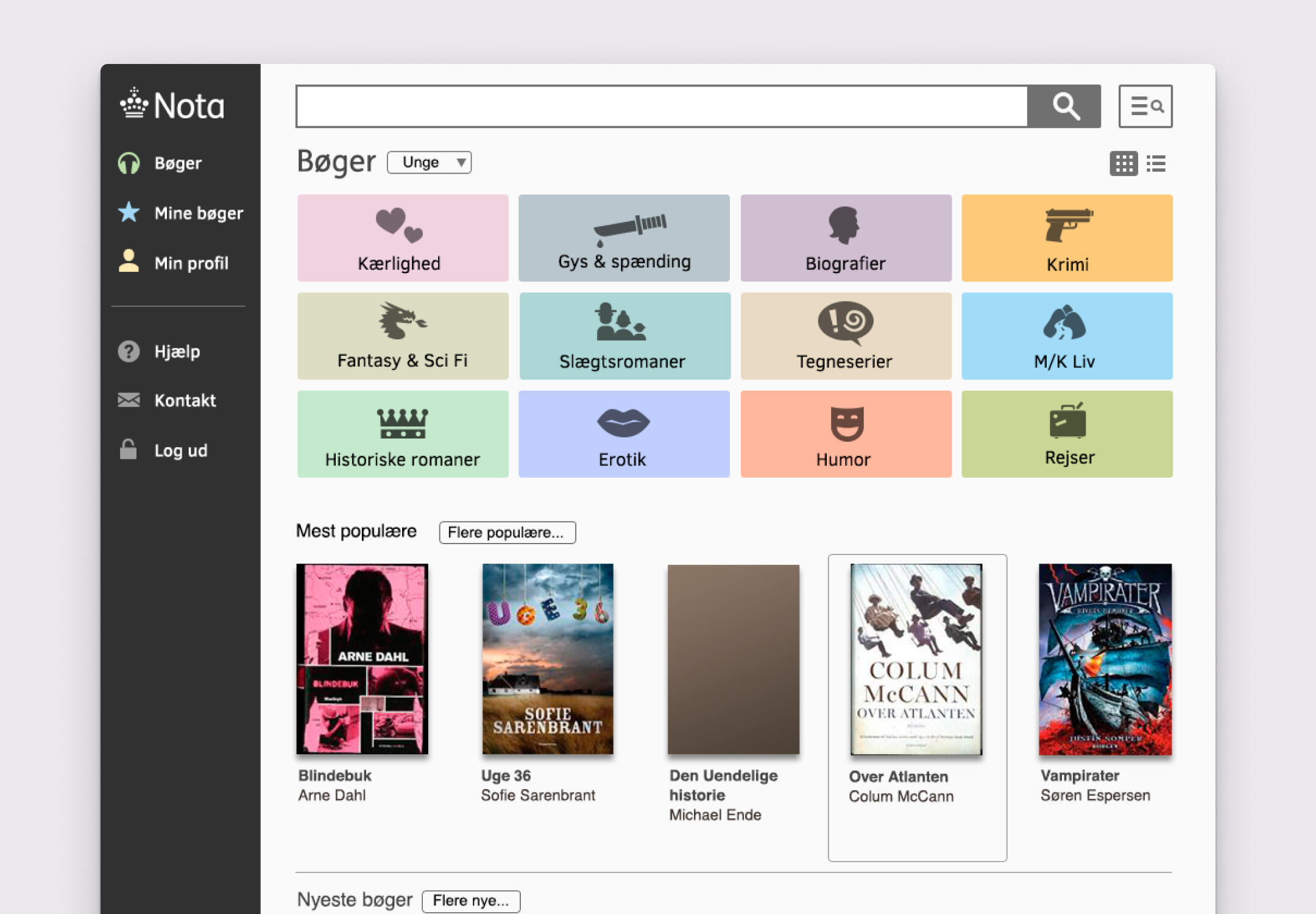
In the browsing section, it was important to make it simple and easy to navigate for all user groups. High contrast and clear forms for the visually impaired and icons for the people with dyslexia.

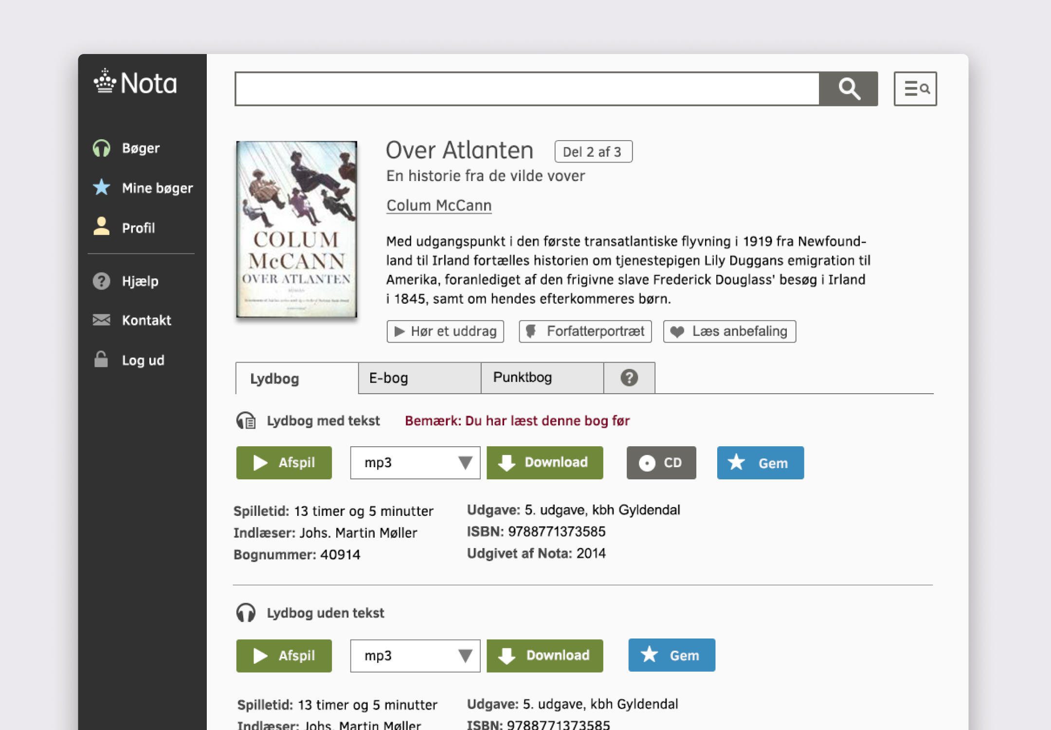
Some books had multiple formats and versions. Previously defined as separate titles, we unified them into a single title page to match how modern users search.

Nota offers a number of highly specialized book formats, both physical and digital. I designed a complete set of highly legible icons for these formats, which later became available under an open Creative Commons license.

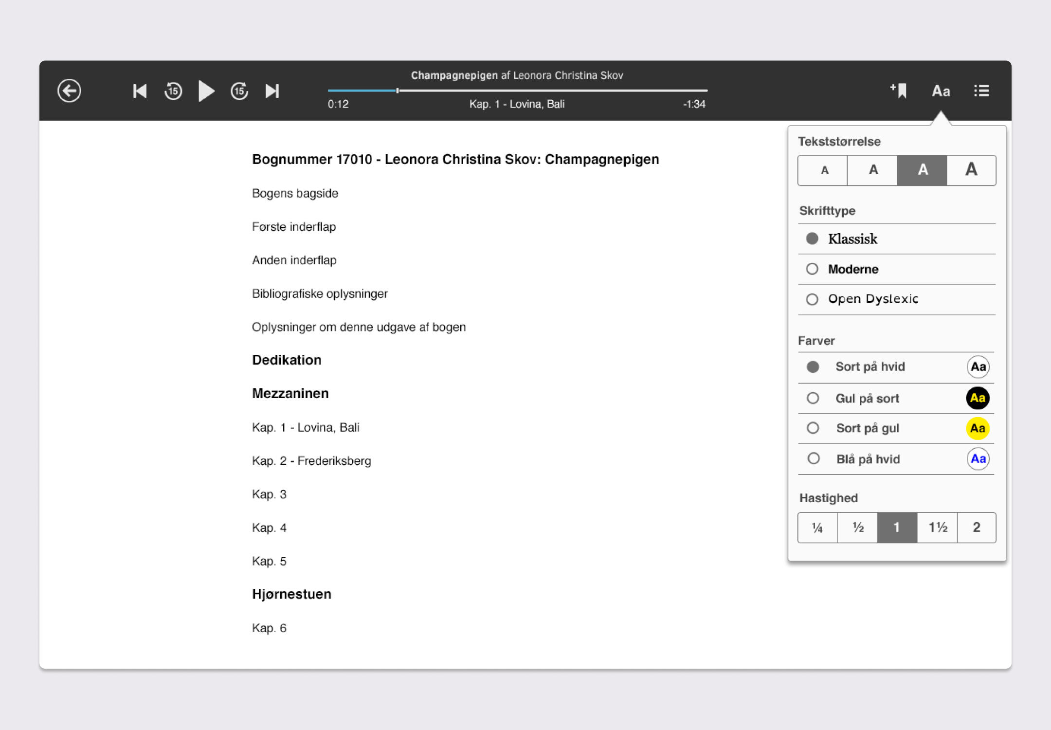
The audiobook streaming player was unique in that users can follow along in the text. The view had to be highly customizable to match users' preferences and accessibility needs.

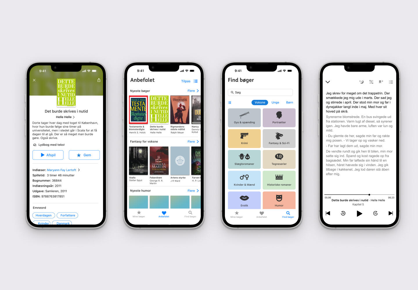
The platform was later accompanied by an phone app.

Queue-it, 2024
Making data make sense
Queue-it's GO platform had a lot of rich traffic data — but most stakeholders couldn't make sense of it. I redesigned the experience to give anyone a quick, shareable overview without needing to log in.
The Goal
Glansable, quick overview
Highly visual and simple data
Easy to share
Completely self serviced
What we came from
We had already started with a very simple report that we could generate on behalf of the user with an overview of their traffic, but the feedback was that it was hard to understand and use for sharing. A few of the the terms made much sense and it was hard to get an quick overview.

Old report
What is Needed
I started by mapping all the data points the report should contain, drawing on user interviews to identify which were most valuable. Since the report would supplement a complex data insights dashboard, the focus was on users unfamiliar with the platform or without direct access: stakeholders and clients that needed to be kept informed.

Graphs concept sketches
New User Group, New Needs
Unlike the rest of the Queue-it platform, which is built for desktop, this report would likely reach users on the go: stakeholders with no prior context of the platform, accessing it on mobile. So it had to work just as well on a small screen and be immediately readable without any background knowledge.
Look and Feel
Queue-it’s monitor page tracks real-time traffic via color-coded tiles that separate metrics rather than consistently represent data states. I adopted this tile color scheme for graphs and dashboards (e.g., inflow: green, wait times: blue), preserving familiarity while boosting scannability for stakeholders—no training needed.

Early color mapping and testing
Icon + color + label + tooltip
Each graph and metric was given an icon, color, label, and tooltip — making them easy to understand at a glance without needing to dig deeper for context.

Is this what you need?
We tested the report with stakeholders using their real waiting room data to see if it met their needs. Most metrics were right, but non-regular users struggled with the terminology. We iterated by rewriting texts and labels for better clarity and accessibility.
Final Product

The Result
The result was a simple but immediately useful solution — accessible on both mobile and desktop and easy to share. Most importantly, it eliminated the need for manually sending customized reports, saving Queue-it significant time from day one.
Going forward...
The plan was always to keep building on the report, adding features like local download and custom time frames, but this was postponed due to a shift in priorities. Even so, we shipped a solid solution that covered users' most immediate needs.
Since then, generative AI has opened up far more flexible ways to generate reports from data, and it's something I'm already exploring.
Queue-it, 2025
Rewriting complexity
The Queue-it GO platform is where customers manage their traffic and set up waiting rooms for their website. It had been developed by many people over many years, so it suffered from inconsistent and complex platform texts that made it harder than necessary for customers to get things done.
Challenge
The Queue-it GO platform consists of a lot of copy that helps users navigate the platform. Users are not only met with a lot of guidance but also new and often highly technical terms.
Feedback from customers had been that they didn't feel confident using the platform.
All copy had been written over the years by various developers and product managers. Terms had evolved and changed over time, so the same things would be described using different terms.
Setting the Ground Rules
Before getting started, I looked into best practices for writing UX copy and how to write for an international user group who often didn't have English as their first language.
A workshop was held to define how we should write on the platform, and a set of rules and guidelines was established.

Team Work!
Next up I assembled a team consisting of people from technical support, marketing, and localization, and set up a structured review and rewrite process — from first draft through reviews, rewrites, and finally implementation and translation.

The process was straightforward: screenshots with new copy added on top so the context would always be clear, and everyone could add their comments directly.
It turned out to be quite tiresome, so we later moved to a shared document.
What started as a simple process turned out to be longer and more complicated than expected — there was often uncertainty, even among us, about what the different terms meant.

What Do We Call It Again?
During the process we collected all insconsistent terms and wordings in en ever expanding "library". That could be used as reference.

Project Becomes a New Process
A critical part of the project was also finding a new process for writing copy for the platform. Together with a copy writer from marketing, I created a simple "UX Writing Cheat Sheet" for anyone to use when checking their writing.

The Impact
During the process, we managed to reduce the length of the copy by about one third and make it easier to read. Internally, there is now a process for writing copy, and terms are much more consistent.
The process alone shed light on how we communicate and write on the platform, and continues to do so going forward.

Going forward
ll the learnings, rules, and terms from the process I later used to train an AI agent, which we now use to create and review copy for the platform.
Low-Fi
Booking vs Hosting
This is a typical UX case for the Low-Fi platform.
Opposite regular live music booking platforms, Low-Fi concerts are created between the host (booker) and the artist, and they also sell tickets to guests through the platform.
This difference wasn't very transparent for the hosts, that often would book the artist for a fixed fee.
My process is a bit simplified here for clarity.


